About 5 or 6 years ago a trend began to step boldly into the web design landscape – the parallax website. This is perhaps more commonly referred to as the scrolling website. Where business pages were previously accessed using clickable ‘tabs’ – ‘Home’, the new trend meant that users could read through entire websites by scrolling down to the bottom.
What’s going for it?
Its visually effective
The parallax website is excellent in terms of visual effect and graphics. Especially as we continue to see some of the biggest brands (think Apple) using more visual content then text. The parallax website is a way to instantly wow your visitors. So much so that we use it for our own Make It Happen website! As a visual brand, our own marketing team feels this design has a bigger impact, and the analytics agree.
Can increase engagement
Research has shown that using the scroll site can direct visitors to spend more time on your website, simply scrolling down to the bottom is how they will find the content. This can keep visitors engaged and result in them taking interest into other areas of your website they might have missed otherwise.
It just looks better
While there of course are some fantastic websites using the traditional model. The parallax web design, when working at it’s optimum offers a seamless experience where the entire brand properties are presented in an attractive way. These sites often look ‘cooler’, and have the ability to offer interactive features such as animation, moving graphics that can make using the site more fun!
Where it falls short…
Search Engine Optimisation
Much of the benefits that are derived from a traditional website with a number of different pages stemming from the home page means that a significant amount of SEO value is lost. It is advised that if you choose this design you take some time make sure all of your major SEO bases are covered. Additionally, and this is a big one due to Google’s recent change in algorithm, the mobile experienced is diminished. Scrolling isn’t the best option here which could impact SEO.
Load times
While the visual quality is optimized, there can be some sacrifices when it comes to load times. This can be a potential problem especially in competitive markets where your customers are seeking a fast interaction/information.
Usability
There is quite a lot of debate around the usability of parallax websites. Issues can occur when this is used for sites that are content heavy, or need to convey a lot of information such as in IT Management. Websites that are also in the business of selling products can also be problematic. Again, think more in terms of ‘wow’ impact and single use.
How it works?
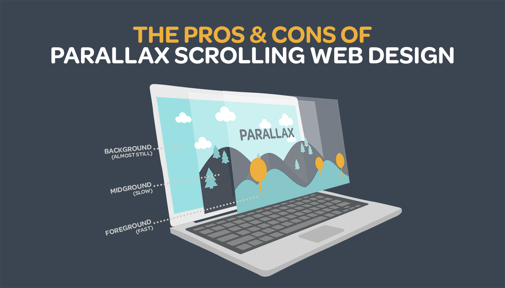
The functionality of the parallax website means that each part within the website is able to move independently. This can essentially bring the effect of a 3D experience to a 2D plane.
More specifically, in terms of animation capabilities, there are 4 ways in which the parallax can be implemented:
- Raster Parallax, which is mostly used to give an optical illusion of movement
- Repeat Pattern, that uses scrolling displays over a repeated background
- Layered Parallax, where the foreground and background objects move at a different pace
- Or, the simple Sprite Method (Source: Envato blog)
What is best for your business?
Parallax scrolling is nowadays used across a wide variety of websites, including portfolios, corporate sites, landing pages, and so on. However, it’s very important that you invest the proper time and seek the best advice to determine if this is the most effective design format for your business. Generally it is best used for websites that serve to begin a relationship with prospects and don't need to house complex, word heavy content or e-commerce.
Want to learn more about how a refresh of your brand and website can win more customers? Get in touch with the team at Make it Happen.