We know from our previous posts focussed on infographics and visual messaging, that 90% of information transmitted to the brain is visual. Add in some additional factors such as 70% of your sensory receptors are in the eyes, and that we have the unique ability to process images 60,000 times faster than text – and the science supporting the use of images becomes clear.
Illustration takes this science, and as an art form in its own right, turns it into something that is full of impact, highly educational and rich in meaning.
Illustrations allow brands, campaigns and product collateral to expressively communicate messages - in a way that is clever, creative and appreciated by audiences.
Illustration indicates value and style
The use of beautiful illustrations inadvertently indicates value. It is obvious to the reader that an investment of time taken by and money paid to an artist was made. Additionally, the better quality of the art work, the more significant or high status the perceived value is. Using illustration is a great way to give your brand some additional gravitas.
Illustration beats stock images for a point of difference
While both illustrations and stock imagery seem to serve the same purpose, an illustration has a unique benefit – it is original. This gives a real opportunity to create something that is memorable, something that sticks and differentiates you from others. Building a mood, style and theme will enrich your campaign or brand story. Don’t forget to let your imagination go wild as the use of illustration is one of the few ways you can infuse your stories with the impossible. Like a dragon explaining the finer points of your campaign (St George Bank as an example).
Illustration can become a powerful brand element
Working together with an artist, you can share the existing specifications of your brand story, and benefit from a series of artworks that compliment other brand elements including typography, colours, tone of voice and logo. This can provide you the added benefit of a cohesive kit of illustrations to be used where appropriate across your website, in newsletters, printed materials, blogs and in reporting. A worthy investment.
Tone, feeling, experience, education
The use of beautiful and creative illustrations can add other more ‘feeling’ and experiential elements such as humour, warmth and fun into your communications. In the same way that other visual styles such as photography add value, illustration has its own unique way of adding depth into your brand story. It is also a powerful educational tool.
How they’re used…
Now that we have talked about illustrations you’ll be surprised how often you’ll see them. When grocery shopping you will see how illustrations on packaging allow products to stand out from their competitors.
Take a look when you next flick through a magazine or newspaper, or drive past outdoor signage and you will likely see some using illustrations as part of their design.
Children’s books lend themselves to illustration as do the cover art for adult fiction as they can go outside the literal and let imagination take them and the reader to exciting places.
B2B companies will often use Illustrations on website banners and to demonstrate a concept using digital platforms. They may bring the animation to life using animated gifs, making the most of the illustrations and allowing a cumulative build of the story. For the same reason illustrations are also great for use in explainer videos.
As an agency we use illustration to develop creative concepts for initial client review. They provide a starting place for story telling which will be built on with other creative techniques.
We have also used illustrators to develop custom typography to differentiate from the competition. The typography on our website including Make It Happen, Brand, Demand etc were crafted by an illustrator.
There are a variety of illustrative styles and the purpose and content of the illustration will define the best approach.
Some great examples of illustration at work…
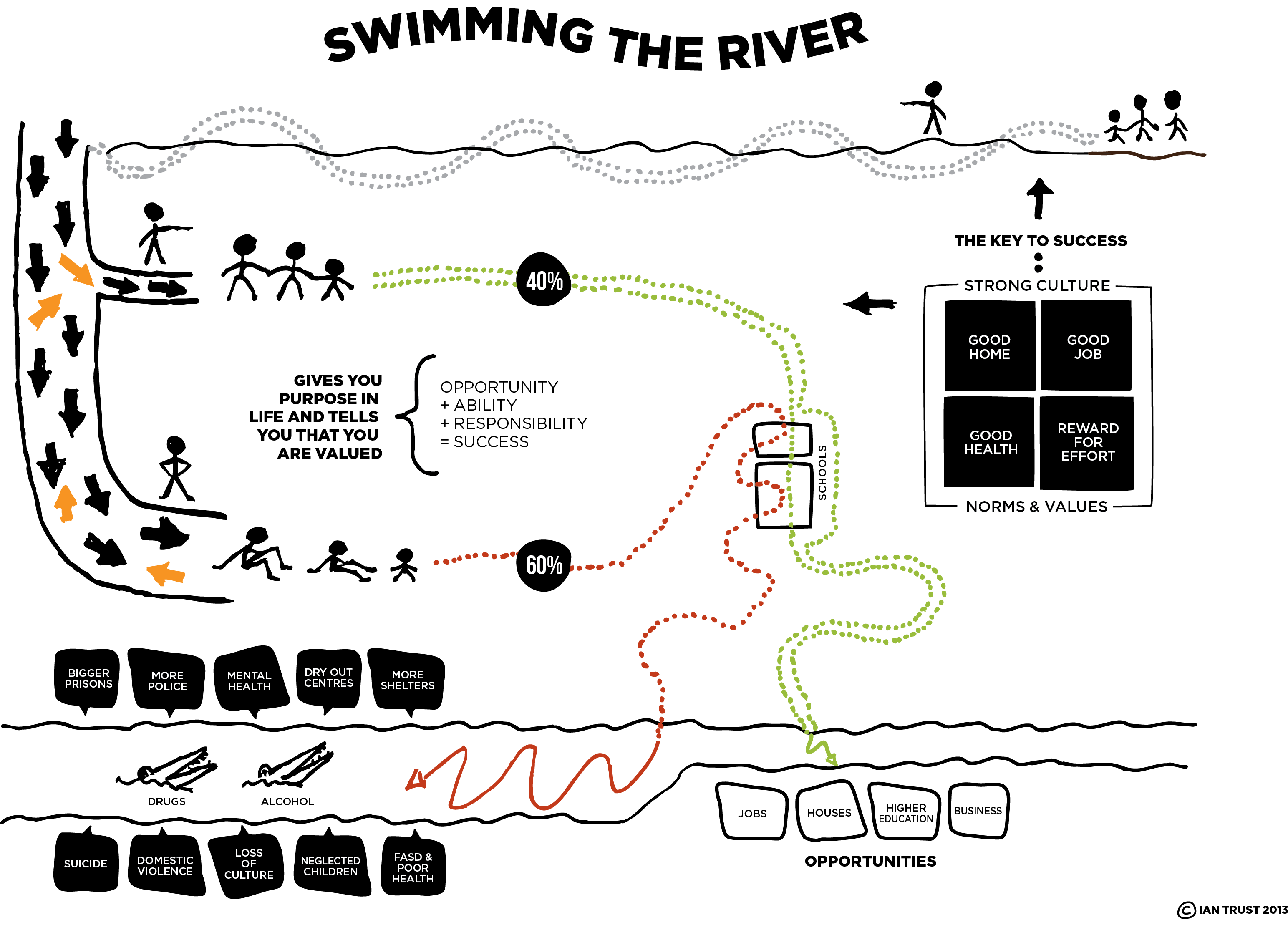
We formalised the illustration below for Ian Trust, Executive Chair of the not-for-profit organisation Wunan Foundation which explains the key issues facing his people, the Aboriginal people of the East Kimberley. Using a metaphor called ‘Swimming the River’, Ian talks about how life was radically changed for his people with the arrival of white settlers. After successfully surviving in a harsh desert environment, Aboriginal people were now faced with the challenge of surviving a completely new, alien way of life. To do this, Ian explains, they must ‘swim the river’ in order to access opportunities such as jobs, housing and business opportunities. The place to learn to ‘swim the river’ is school.
 Working together with a talented graphic or visual artist, guarantees a memorable point of difference. We collaborate with the best in the industry to create a well-rounded brand, re-brand or campaign. If you’d like to know more, get in touch with us today.


