Work
NFP Brand refresh
01.
The Brief
An established brand who were being constrained by the three ‘soldiers’ in the logo. Retaining the name Soldier On, they needed to visually identify that they provide support to soldiers, sailors and airmen.
02.
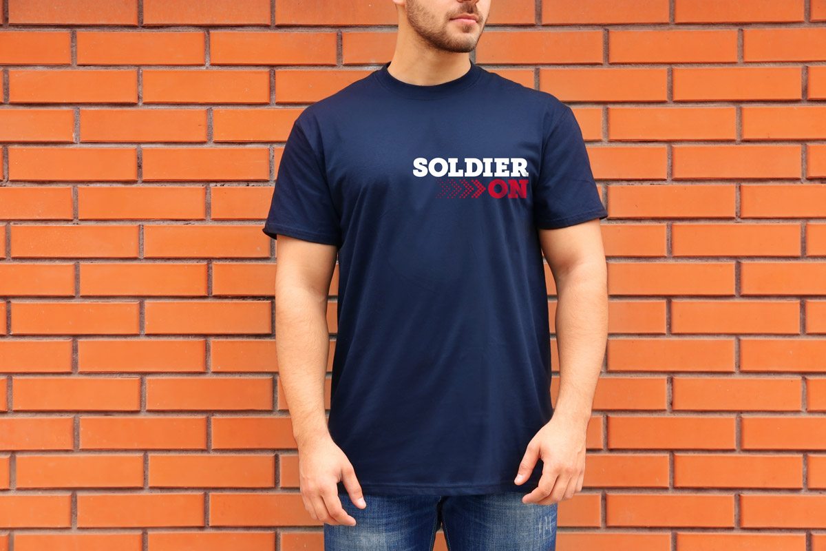
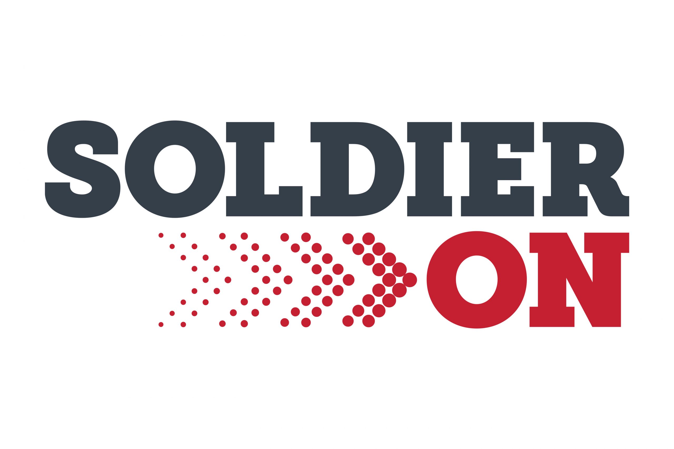
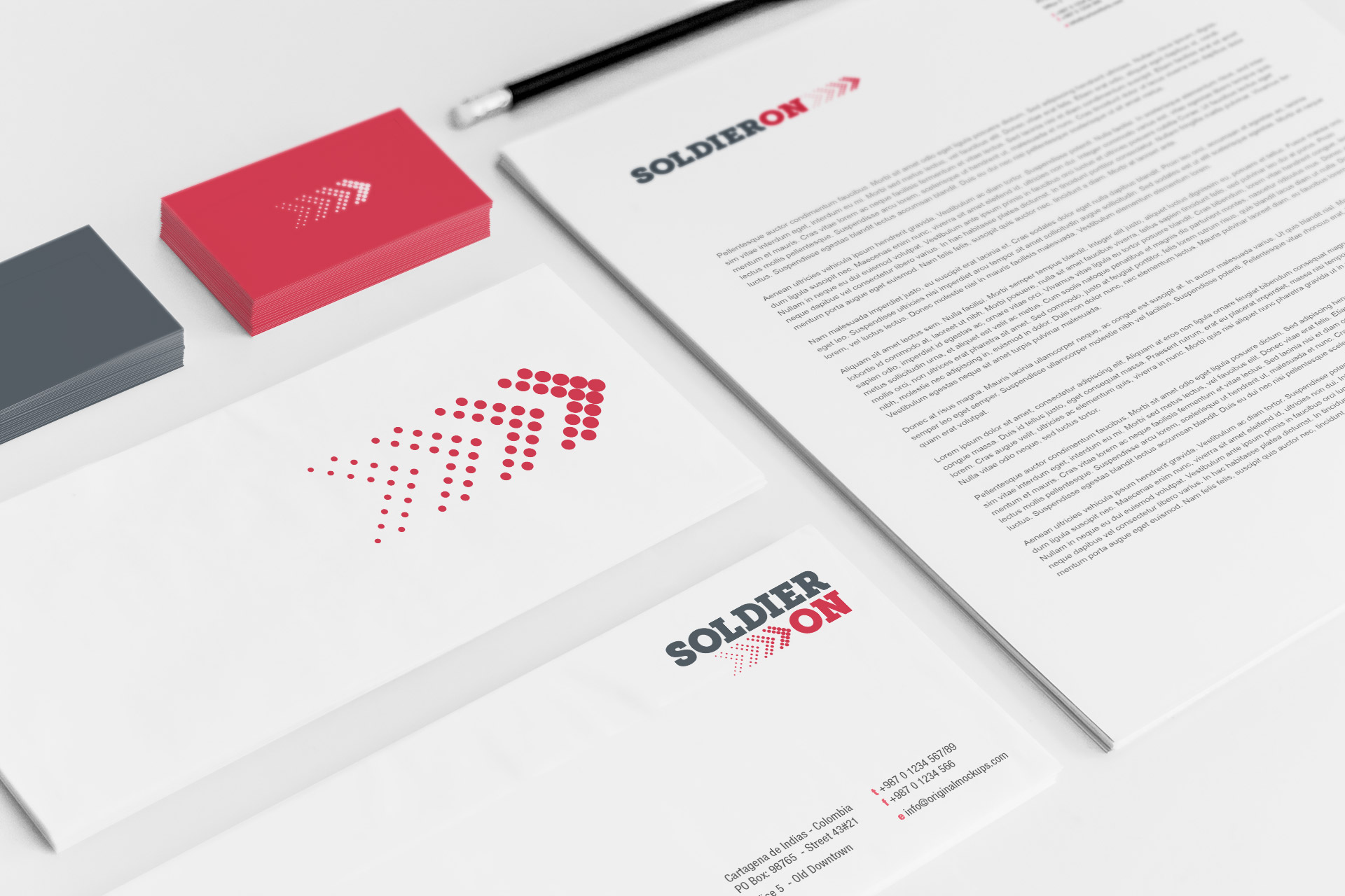
The Approach
We created a new, modern visual identity that propelled Soldier On to its next stage of growth. We retained the words Soldier On and the colour red but modernised the typography and the colour of the red. We introduced a graphic element which demonstrated small steps toward a positive outcome.
03.
The Results
We navigated multiple changes of project ownership and direction, and created a brand that was authentic, emotive and positive. The new brand brought to life an organisation with a focus on helping veterans and their families build successful futures by providing mental health support services, social connectedness activities and programs, employment, training and education services and opportunities.